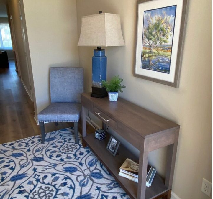
 Noticing a need to demystify the idea that color is a design component that is scary, I decided to contact the editor of Spaces magazine. My pitch to the editor was that I was tired of seeing light gray and white in all the model homes for the past two years. Blah! Those two colors look so much happier when they are paired with a splash of pizzazz. As a result of our conversation I am happy to say I was published in the Twin Cities Spaces Magazine 2020 Spring/Summer Resources Edition.
If you get the shakes and feel nervous, start small. Try purchasing a set of decorative pillows in your favorite color. One rule to follow: the pillows need to be in a printed fabric, no solid colors. Large plaids are acceptable.
Another area that can introduce a splash of color into your home is on the walls. Color experts agree that this is one area that our clients struggle with. Here are a few tricks to make the process a bit easier:
- Bring an item from home that you’re trying to coordinate paint with.
- Look at the paint sample and your item from home over by the door or window so that you can view it in natural sunlight.
- Once you find a color to consider, tape together 4 of the little sample cards to give you a larger sample.
- Once home, tape an 8.5 x 11” sheet of white paper on the wall and tape the paint sample onto the paper. This gives you a truer idea of the color you are considering without getting the influence from the current wall.
The truth about Shades of Gray
When everything in the stores are cool shades of gray, it’s pretty hard to avoid buying gray. Cool grays make me edgy. Furthermore, they give me a sterile vibe. I don’t know about you but I don’t want to live in a sterile environment. We color experts have nothing against gray. I suggest using it in a warmer palette with a brown undertone rather than blue. Taupes have been around for the last thirty years and I think will continue to be popular for thirty more. One of my favorite paint colors is by Ben Moore. It’s from their Affinity line, #AF-100, and called Pashmina.
If you need help introducing a splash of color into your home, contact me, color expert, Marsha Anderson at 651-470-7724

